News
Nov 20, 2019 _ news
Finding the Spotlight: Cincinnati Children’s Arrival Featured in Healthcare Design
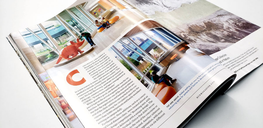
The reconfiguration and redesign of the arrival sequence at Cincinnati Children’s Hospital Medical Center was recently featured in Healthcare Design.
The article explains, Cincinnati Children’s had an interesting problem on its hands. The hospital’s arrival concourse had seen a lot of growth in recent years, adding several clinics, new research facilities, and expanded amenity spaces. Unfortunately, the result felt cobbled together as new additions vied for attention, and ill-placed walls and elevators created confusing transitions for the concourse’s 3,000+ daily visitors.
An interdisciplinary, collaborative design team including GBBN (full architectural and interior design services) and Kolar (wayfinding, art, graphics, positive distractions) worked with Cincinnati Children’s to make the arrival experience easier, more welcoming, and friendlier. The redesign simplifies wayfinding for visitors, eliminating a barrage of signage. Using neutral colors along the arrival concourse, the redesign marks important entrances to elevators, buildings, and clinics with a pop of color and other visual cues to help orient visitors.
One of the biggest transformations of the arrival concourse involved rerouting the main entrance from the parking garage, so it opens to a clear view of the welcome desk – it had previously been hidden behind a wall.
Another important change involved the creation of spaces out of the flow of traffic, where arriving families can take a moment to collect themselves. “Arriving families are not only anxious,” explains GBBN Principal and Senior Interior Designer, Brooke Behnfeldt, “but they also tend to carry a lot of stuff (strollers, coats, baby bags, and toys). So, we created landing pads to give them a space to decompress.”
Read more about the design in Healthcare Design or our case study.


