Insights
Aug 1, 2024 _ insights
Libraries Are for People: Space Supports Programming Changes at University of Pittsburgh’s Hillman Library
Part one of our series on academic libraries. Read part two here.

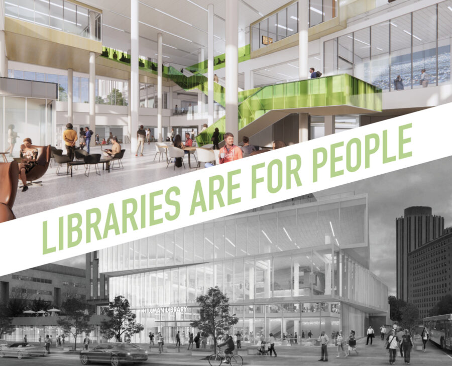
The way students learn has changed. As a result, academic libraries are grappling with an identity crisis. No longer seen as merely archives for print materials or a place for silent, solitary work, leading academic libraries are alive with activity and support hands-on learning and information creation. Digitization has made many resources easily accessible and widely shareable. How should academic libraries respond to these and other changes? Our Hillman Library transformation at the University of Pittsburgh offers some insights. In this article, we’ll focus on how architecture and design support programming changes at Hillman. A follow-up article will focus on how architecture and design help reaffirm the library’s role as a connector of campus and community.
So, what’s changed since Hillman Library was built in 1968?
1. Digital communication and shared online databases allow for easy, widespread information sharing, so not every library needs to have its own copy of materials.
Increasingly, little-used volumes are being stored off-site or in automated storage and retrieval systems. Students may not browse shelves or card catalogues like they used to, but they still want space that supports their need for making, discovering, and group work.
Hillman’s response: Hillman removed 70% of their collection, trimming on-site volumes from 91,000 linear feet of shelves to 27,000 linear feet focused on distinct collections. This decrease allowed an increase in space for specialty services, group study, makerspaces, and classrooms.
 But people expect to see books at a library, right? By focusing on distinct collections, Hillman’s librarians can curate and rotate displays, making them easily browsable. These displays may include books, but also unique artifacts, like the University of Pittsburgh’s collection of August Wilson’s personal papers, or of zombie masks from film director George Romero’s Night of the Living Dead. Hillman’s renovation includes digital screens so they can broadly exhibit fragile, or digital only pieces, as well as student research.
Many such display spaces, as well as administrative offices and makerspaces, are strategically organized around Hillman’s new, monumental staircase, which encourages movement but also browsing and discovery.
2. Students do more collaborative and group work.
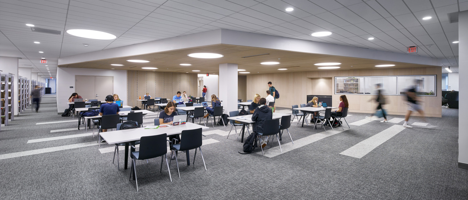
Hillman’s response: Adding more group study spaces of different sizes and uses. Hillman only had four group study rooms in the whole building. Now there are 18 on the ground floor, six on the second floor, 12 on the third, and 11 on the 4th floor. These rooms are popular and often get booked solid at the beginning of the year for several weeks between the hours of 10am-2am! As my colleague, GBBN’s Director of Higher Education Zachary Zettler, has written about before, students find comfort in being together. Some are working collaboratively on a group project, and some are groups of friends who just want to do their own thing, but in a shared space.
Hillman also added teaching space. Two new classrooms; two collaboration seminar rooms (for hosting events, remote learning, or seminars); an expanded digital scholarship classroom; and a special collections instruction room. These allow Hillman to host events like conferences or guest speakers, or provide meeting space for a seminar with a remote instructor.
At Hillman, lower floors were designed to be more boisterous and social; upper floors were designed for more heads down work while still giving students choices in working alone or together.
3. Awareness around the connection between daylight and well-being.
Hillman’s response: Private offices, located along two sides of the building’s perimeter, were blocking light into the library. Study carrels were hogging the light along the other building edges. Relocating these has helped make access to light more equitable by bringing light and views deeper into the building.
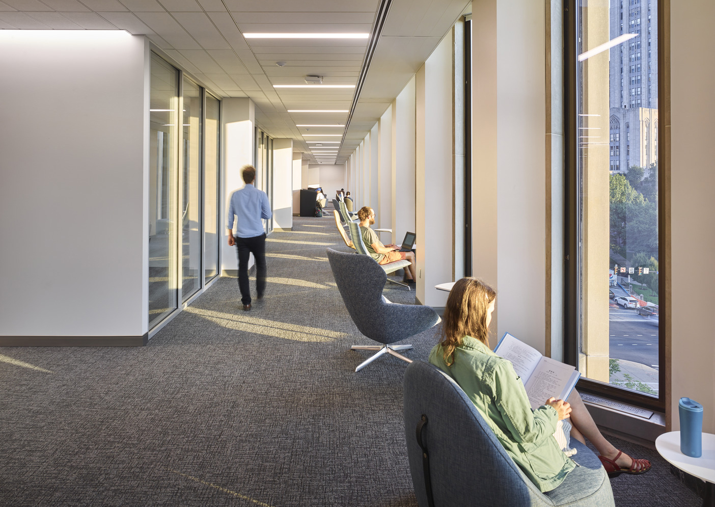
But office space is still needed. At Hillman, staff space was consolidated and pulled into the core of the building, near the monumental stair. This provides the needed space, puts staff space in closer proximity to student activity, and allows more light to flow into the building for more people to enjoy.
4. Students engage in more active, hands-on learning.
Hillman’s response: Adding makerspaces that include CNC machines; laser cutters; sewing machines; 3D printing; VR/AR; and Film & Audio Recording Studios. While a non-engineering student is unlikely to seek out tools in the engineering department, in the library it’s okay to be a beginner and experiment with different technologies. A makerspace is a place to discover and pursue new passions and skills. For example, Hillman’s book binding tools are organized into a space called the Text and conText Lab which offers cla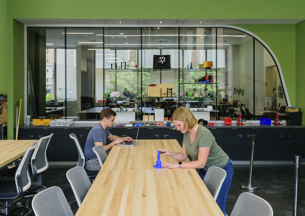 sses in letterpress, print making, and book binding and is located near the special collections area. This allows students to study rare books, analyze the material, and remake them on their own.
Hillman Library partnered with the University of Pittsburgh’s Center for Creativity for this space, which provides some of the equipment. They both provide staff and service programming.
What hasn’t changed?
The library’s role as the heart of campus. The need for students to have a place where they feel connected to their work, their school, their peers, to the expertise of librarians, and, on urban campuses like Pitt, connected to the larger community. They want to feel welcomed and included and able to follow their passions.
Owned by none, welcome to all, academic libraries are democratizing. They play a central role in student success. Adapting to new students’ needs and expectations helps ensure academic libraries remain relevant and vibrant campus magnets.

Sarah Kusuma Rubritz, AIA is an associate at GBBN. Informed by the latest research and design technology, Sarah has helped shape GBBN’s approach to academic libraries as they welcome new generations of students and learning styles. Whether she’s designing a library, an archive, an arts space, or a workplace, Sarah employs her talent for seeing the big picture without losing sight of the minute details that catapult projects beyond client expectations.
